

By Jehm Studio
Posted in Ceative Design
A well-designed brochure advertises your products to potential customers and meets your objectives of creating brand awareness. Many companies use brochures to market their products because brochures are small and easy to carry around yet contain a lot of product-specific information.
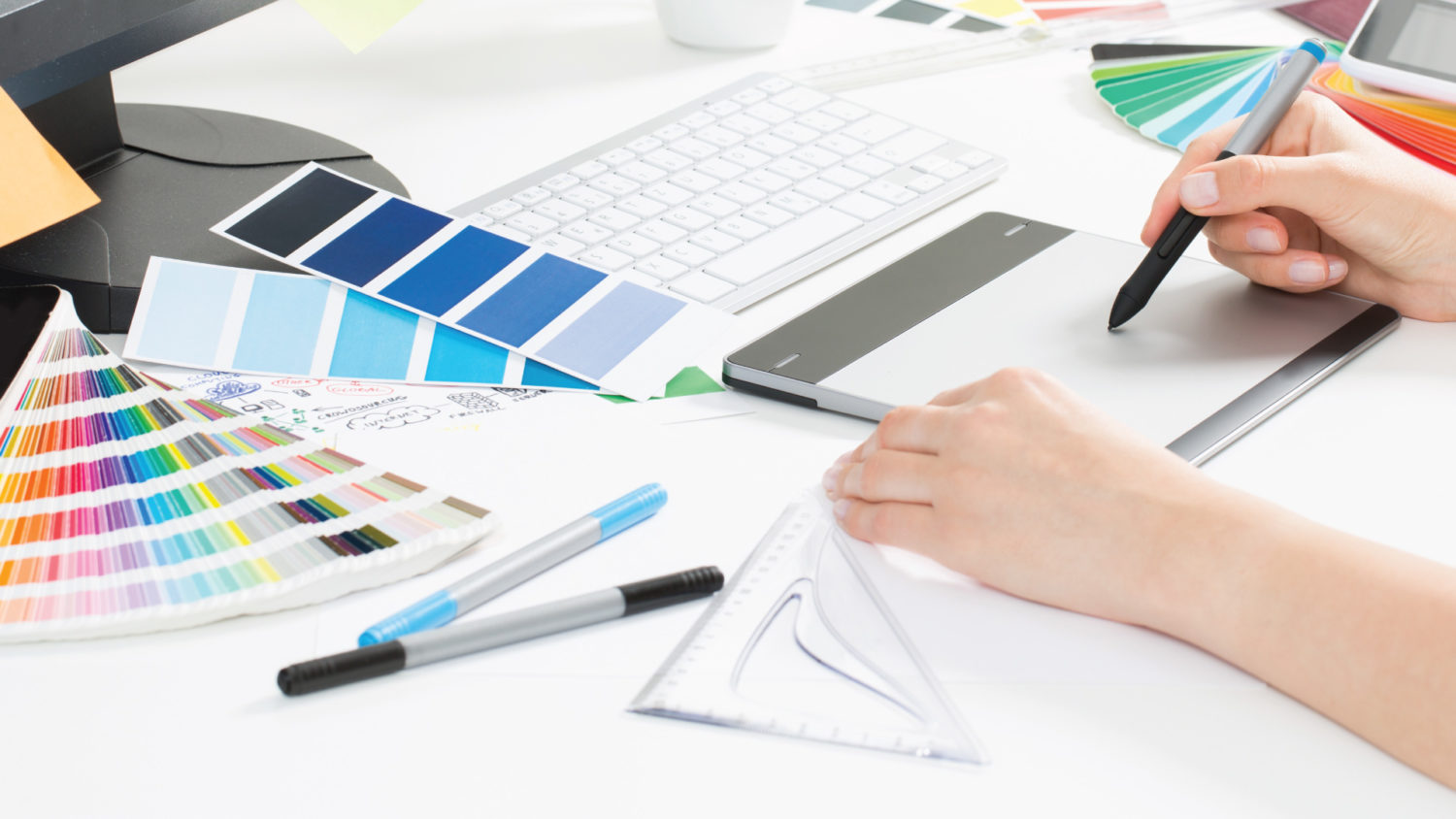
1. Objective and Target Audience
What is the purpose of your brochure? Who are you reaching out to? These two questions will be your guiding compass when you design your brochure. Your brochure content must be tailored to your objective and target audience.
 Image courtesy: GraphicsFuel
For corporate profiles, the brochures usually contain corporate information and the company’s salespeople. A possible idea is to have a 2 to 3-page simple brochure with infographics for easy readability. Product catalogues usually come in the form of booklets with photography images and product specifications while realty brochures comprise many property photos.
 Foreshore Realty 6pp Folder Brochure Design
2. Gather your content and start organising
Before you start to design your brochure, gather your content. Conduct research, purchase stock images/arrange photography sessions, write copy. Beauty industry brochures need to address how their products can improve the appearances of their customers. Realty brochures often contain visual diagrams such as floor plans and 3D renders to give customers a better idea of how the properties look like. Your content should have a smooth flow so as to enhance the reading experience for your customers.

3. Design phase
Your brochure has to be in line with your corporate identity. This ensures that your brand identity remains consistent which in turn projects professionalism and builds trust. Some tips to remain consistent are to standardise the brand colours, fonts and typography.
Choose a theme for your brochure and ensure that the elements of your brochure revolve around the theme.
Do not use more than 3 fonts. One font and size can be used for the header and two others can be used for the sub-header and body text.
Keep your brochure design simple and clutter-free. Organise your brochure content in a structured and coherent manner.
A good brochure uses simple and easily understandable language, rather than bombastic vocabulary. The simpler it is, the more people you can reach out to.

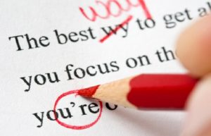
4. Proof-read and proof-read again
Before sending your brochure for printing, remember to proofread all the text carefully.
Firstly, read from the point of a view of a customer. Does the text communicate your intention well? Does it flow well? Is it easy to read and understand? If you answer no to any of these questions, rewrite it until you are satisfied with it.
The second step requires you to be a grammar Nazi and spot spelling or grammatical errors, if there are any. Language errors affect how your customers perceive your brand and surely you don’t want that to happen!
5. Choose the finishing for printing
How thick do you want your brochure to be? A higher GSM (grams per square metre) gives you a thicker paper which appears more professional.
Glossy and matte finishes accomplish different objectives. Glossy finishes make the colours in the brochure appear brighter and more dazzling, making it suitable for product catalogues. On the other hand, matte finishes exude a sophisticated feel which will appeal to corporate clients.
Die cutting comprises cutting paper into irregular shapes such as shapes or letters with a metal die. The end product looks unique and definitely stands out from other brochures.
For a dimensional texture, consider embossing and debossing. Embossing creates a raised impression while debossing gives you a depressed impression.
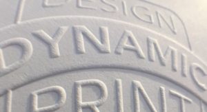 Embossing example
To create a glossy coating on your brochure, check out spot UV varnishes. They are created by applying paper varnish to the brochure surface and hardening it with UV light.
 Spot-UV example
Premium printing and finishing will add a wow factor to your brochure, allowing it to stand out and capture people’s attention. Approach your design consultant now to leverage on printing technology and explore the endless possibilities!
 Hotstamping example : Silver
Company Profile: Jehm Studio is a creative design agency based in Singapore which specialises in creating captivating and impactful collaterals to support your company’s marketing efforts.


Comments are closed.